Data Tampering At USHCN/GISS
The measured USHCN daily temperature data shows a decline in US temperatures since the 1930s. But before they release it to the public, they put it thorough a series of adjustments which change it from a cooling trend to a warming trend.
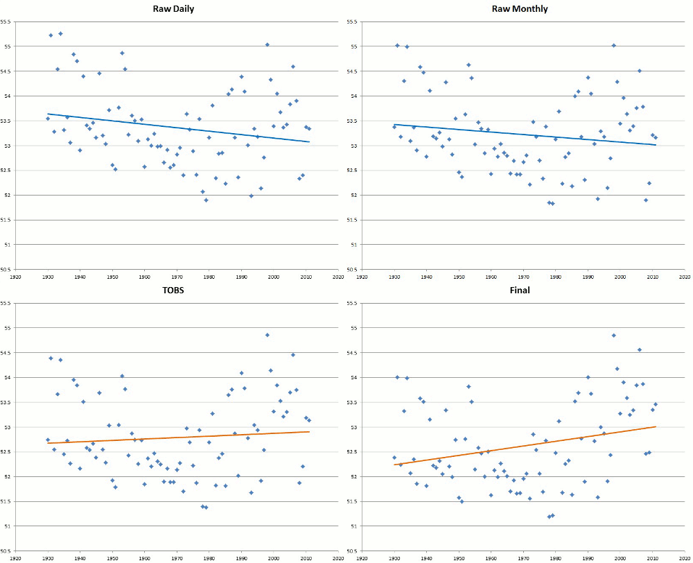
The graph below shows the difference between the published data and the measured data.

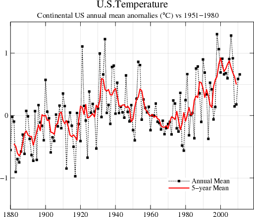
The next blink comparator shows changes in the US temperature record from GISS. It alternates between their 1999 graph and the 2012 version of the same graph. The past is cooled and the present is warmed.
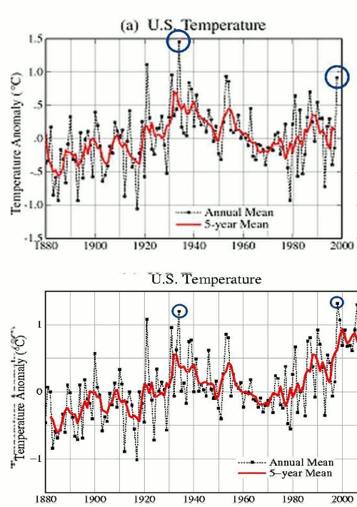
The next graph shows the difference between the 2012 version of the GISS US temperature graph, and 1999 version.

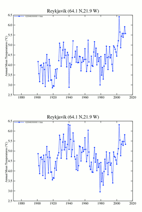
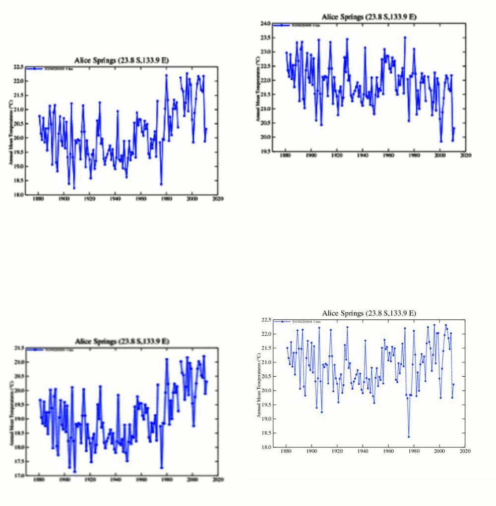
How the US hockey stick was built
As of 1999, there wasn’t any warming in the US
Hansen made these remarkable comments in 1999 :
Empirical evidence does not lend much support to the notion that climate is headed precipitately toward more extreme heat and drought. The drought of 1999 covered a smaller area than the 1988 drought, when the Mississippi almost dried up. And 1988 was a temporary inconvenience as compared with repeated droughts during the 1930s “Dust Bowl” that caused an exodus from the prairies, as chronicled in Steinbeck’s Grapes of Wrath…..
in the U.S. there has been little temperature change in the past 50 years, the time of rapidly increasing greenhouse gases — in fact, there was a slight cooling throughout much of the country
At that time, GISS US temperature data showed an 80+ year decline in US temperatures, with 1934, 1921 and 1931 being the three hottest years
This data has been deleted from the GISS web site, but originally resided at this URL
It has been archived here :
www.john-daly.com/usatemps.006
The next graph shows the 1920-1999 changes which Hansen made to the US temperature record since 1999 – in GISS version 3.
The GISS US temperature graph looks like this
The next blink comparator shows the changes that were made to the US temperature data since 1999. The year 1998 was promoted from #4 to #1.

Hockey sticks are indeed man-made – by climate activists pretending to be scientific heads of government agencies.




No comments:
Post a Comment